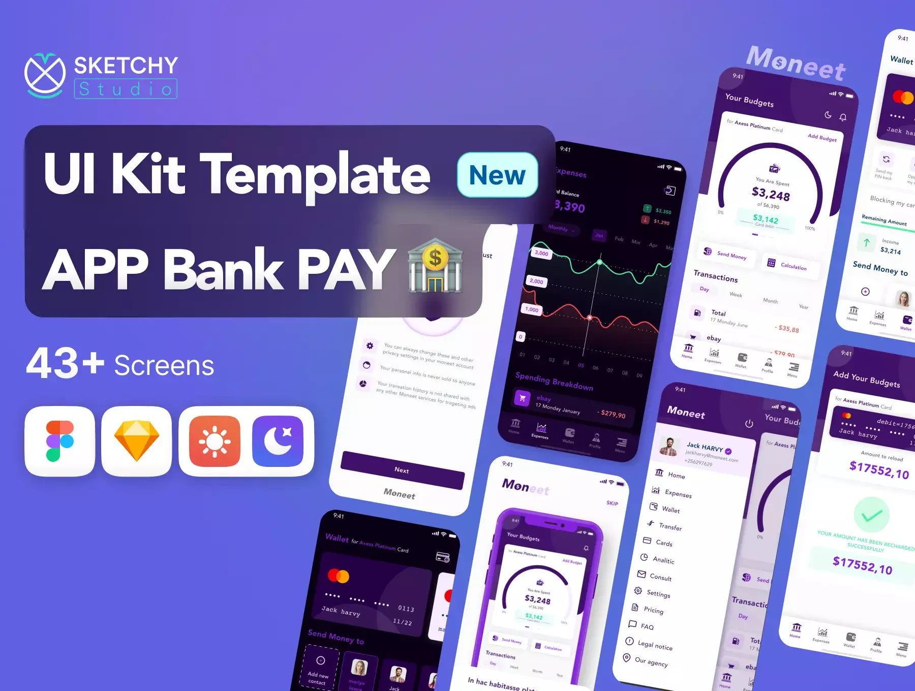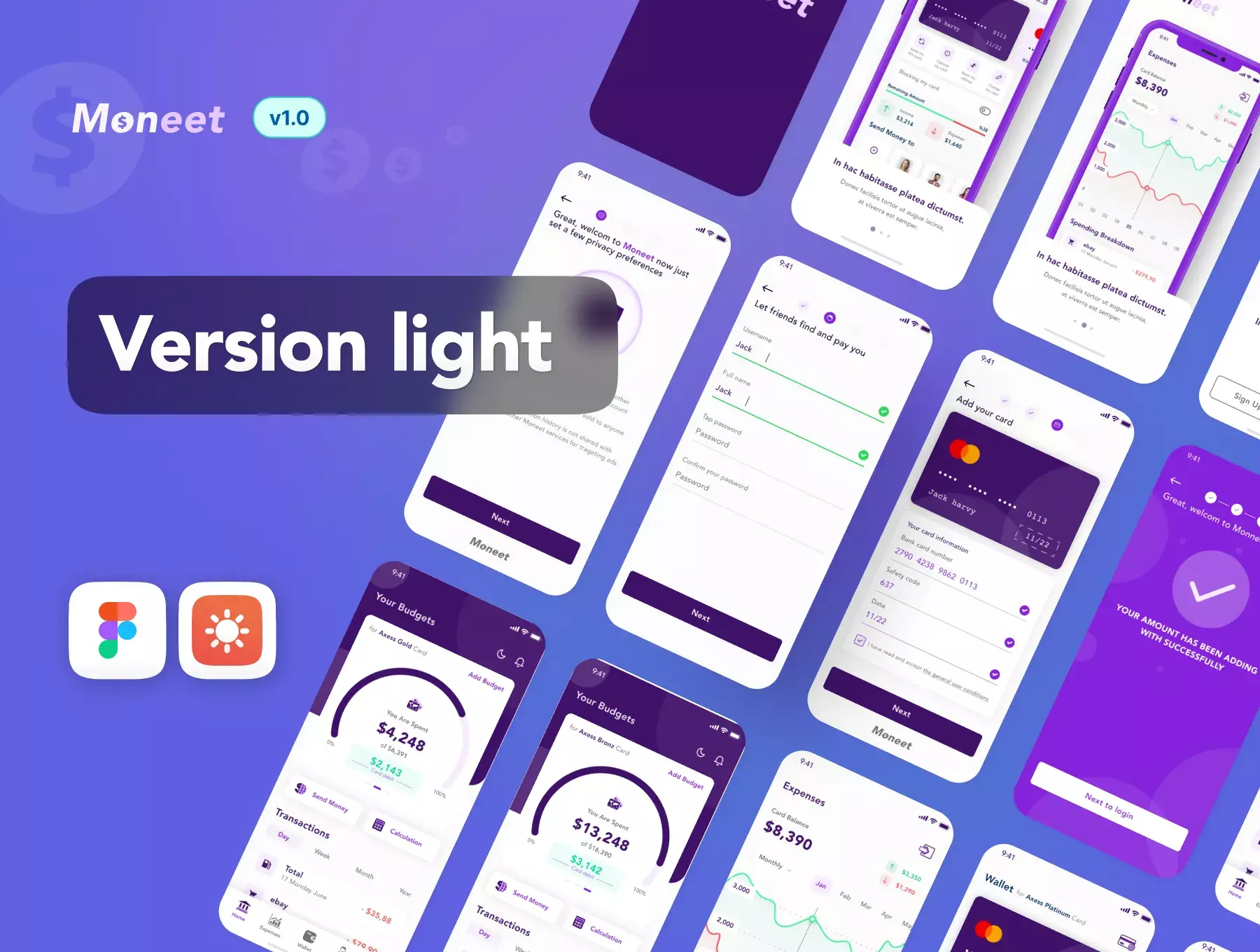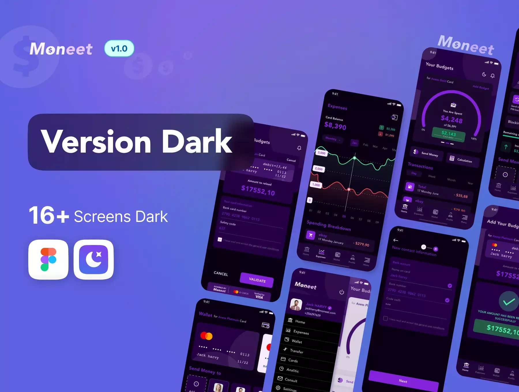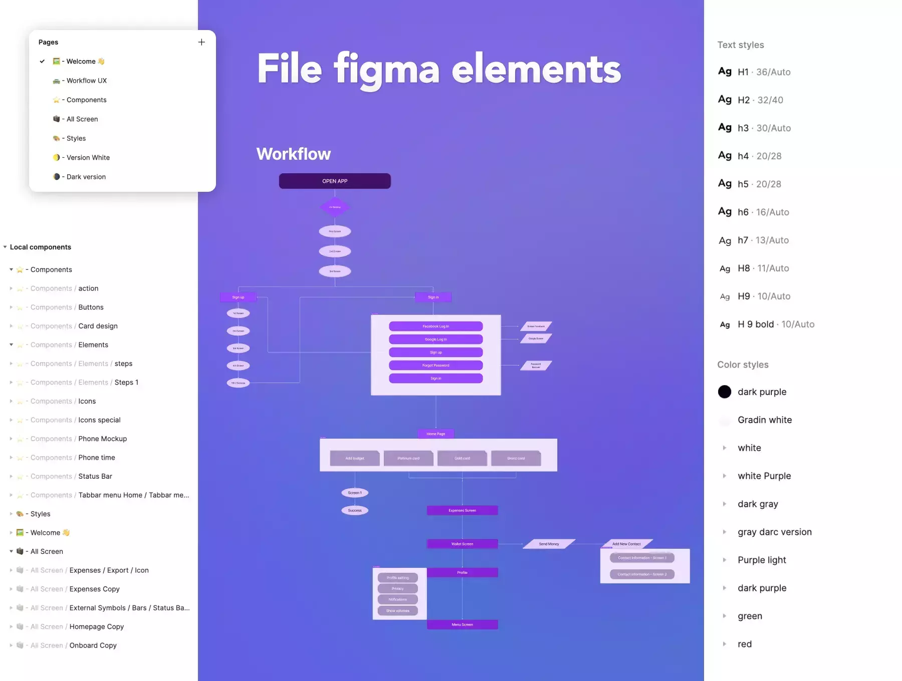
Monnet's workflow provides a clear understanding of how your application should flow, from the login process to account management and transactions. This helps ensure that your users can navigate through your application with ease and without confusion.
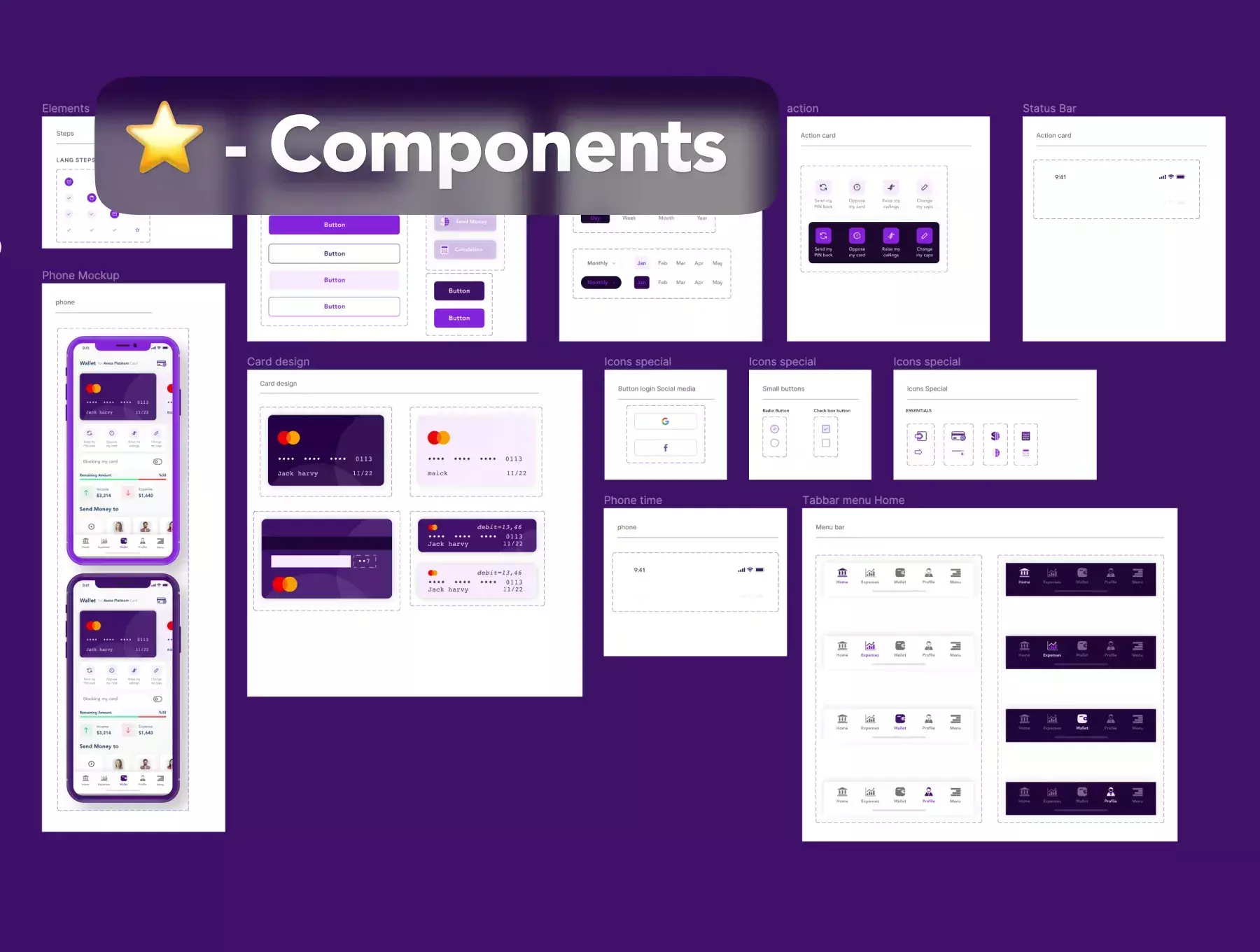
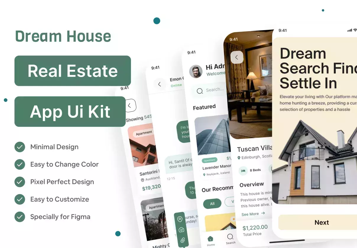
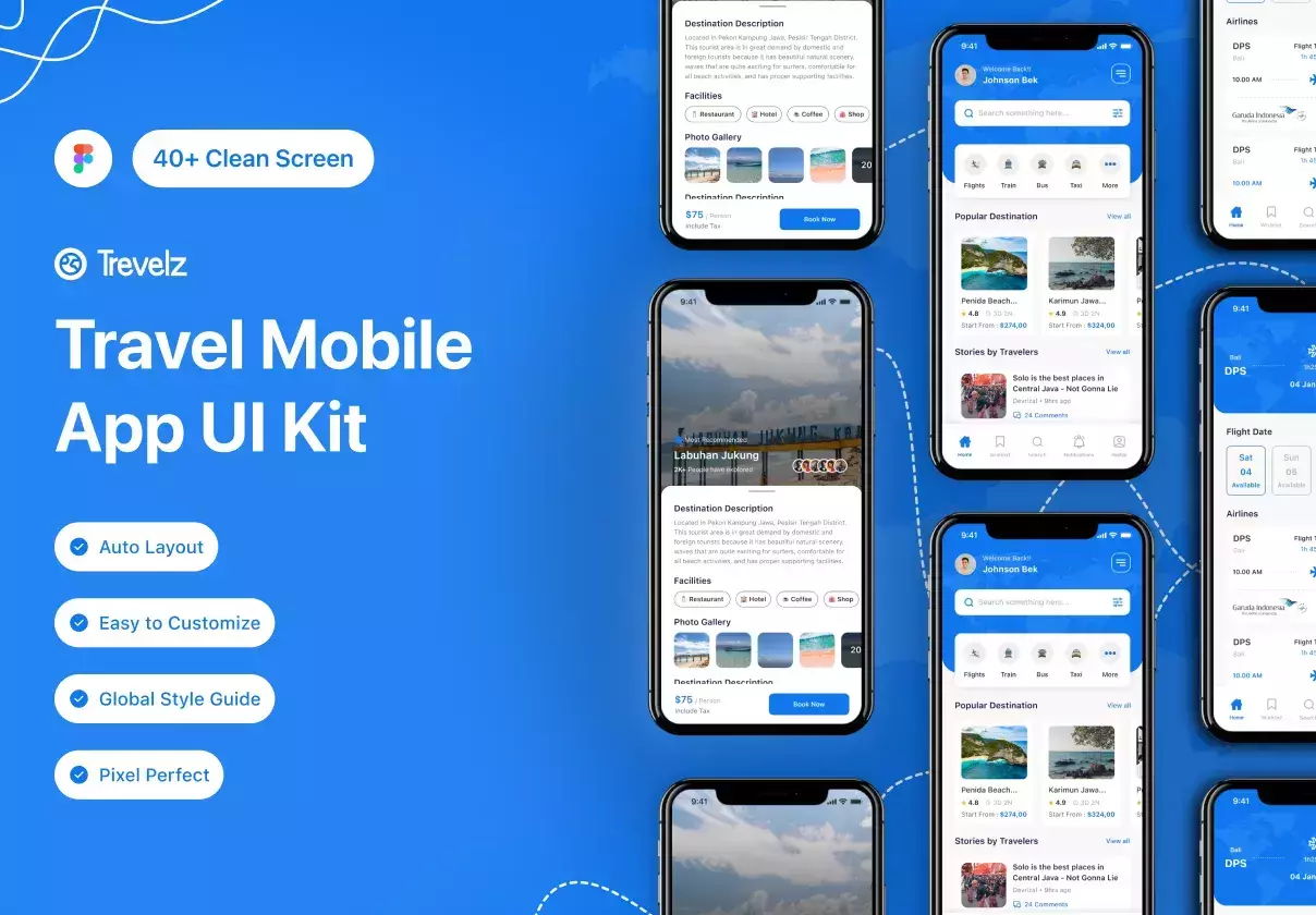
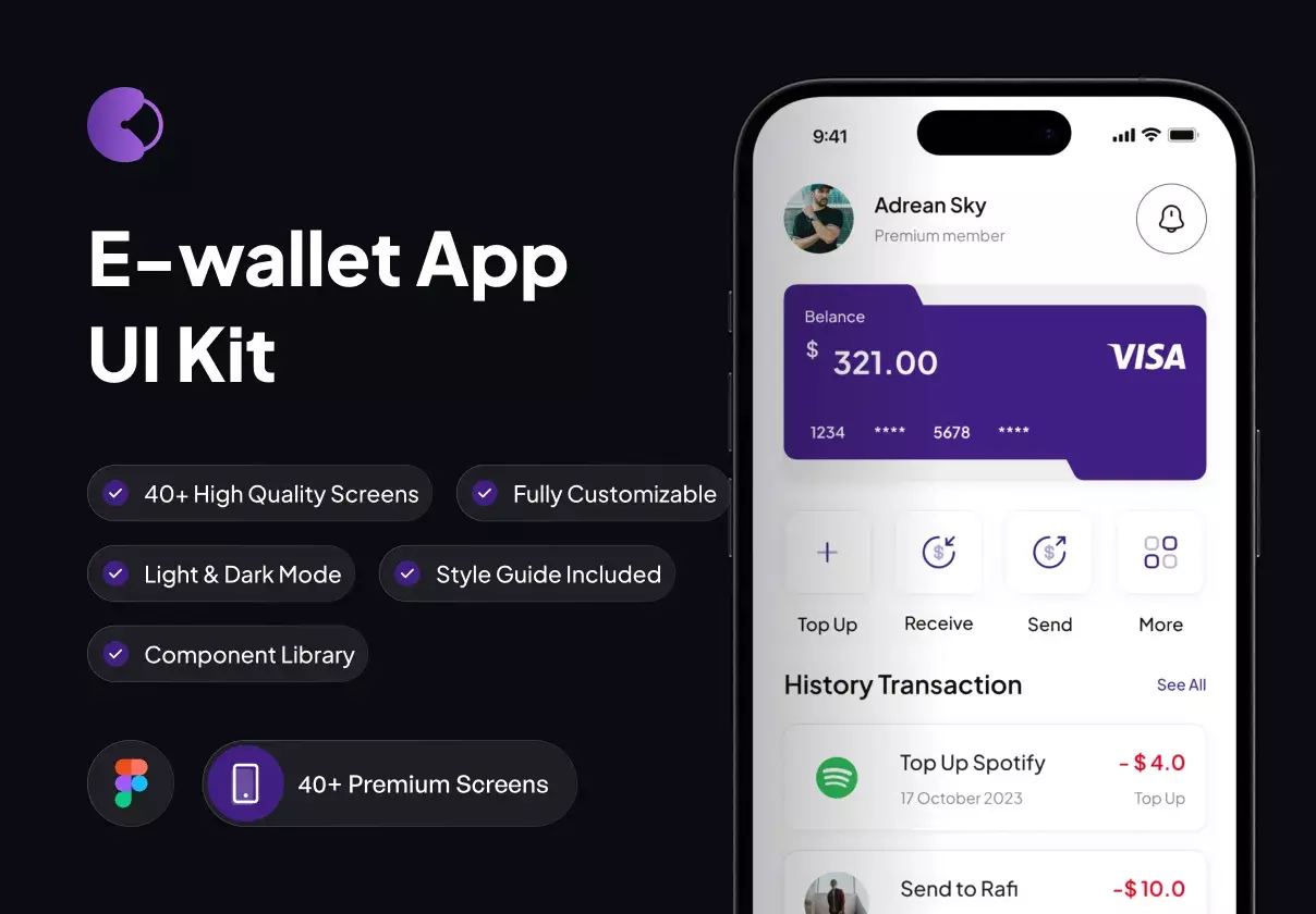
Monnet's 43 meticulously crafted components and 28 screens have been designed to enhance the user experience of your banking application. With its clean and intuitive design, Monnet ensures that your users can access the information they need quickly and efficiently.
In addition to its comprehensive workflow and component library, Monnet also includes both dark and light modes, so your users can choose the interface that best suits their preferences. Additionally, Monnet's styles and symbols have been carefully crafted to ensure consistency throughout the application.
Monnet goes above and beyond by including a fully functional prototype to guide you in developing your banking application. This prototype allows you to test the user flow and functionality of your application before investing time and resources in development. With the prototype, you can see how the workflow and components come together to create a seamless user experience.
Monnet is the perfect tool for saving time and effort in designing your banking application's user interface, allowing you to focus on other important aspects of your project. Whether you're a seasoned designer or just starting out, Monnet provides the framework you need to bring your banking application to life.
Purchase Monnet today and give your banking application the user-friendly and professional interface it deserves, with a detailed workflow, comprehensive component library, and intuitive design.
⭐ Product Highlights :
43 Screens (iOS/Android )
100% Editable & Customizable
Compatibility: Figma & Sketch
Light & Dark Theme Included
Design System & a lot of Components
Fully Auto Layout
Well Organized Layers System
Unique, Stylish & Modern
Used Figma Free Fonts
Pixel Perfect Design
Global Styleguide
Easily Drag & Drop Design
Advanced Prototype-Guide
Workflow
👌 For whom it helps
Designers, skip creating from scratch those complicated components along with every new project in Figma. Use UI kits to concentrate on important things, not on design routine.
Developers, this design library allows you to learn or enhance design skills. Jump into a process, where you only need to drag and fit a block to build good-looking pages.
Managers & CEOs, these templates are ready to be published for teams and provide an opportunity to quickstart massive prototyping immediately, save time and release apps faster.
