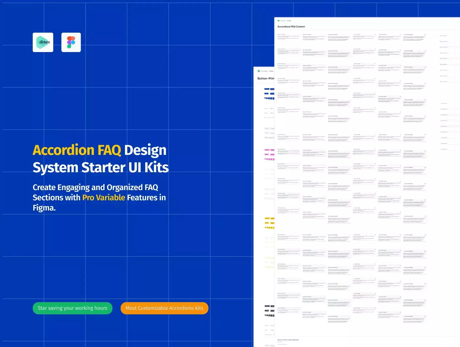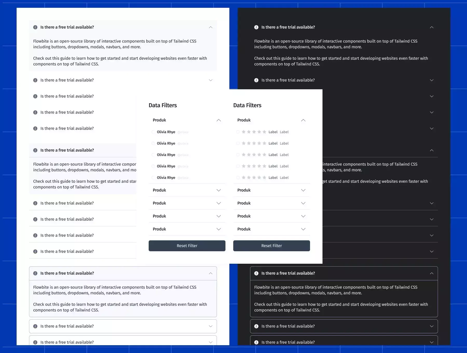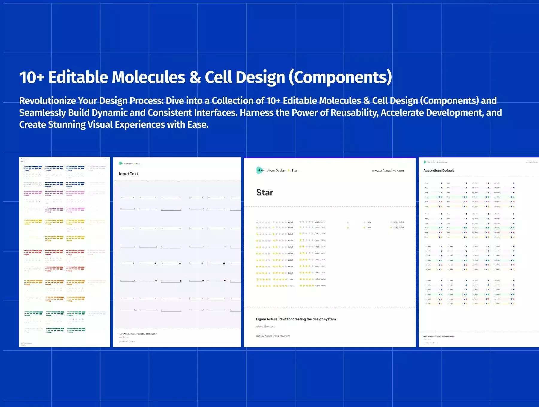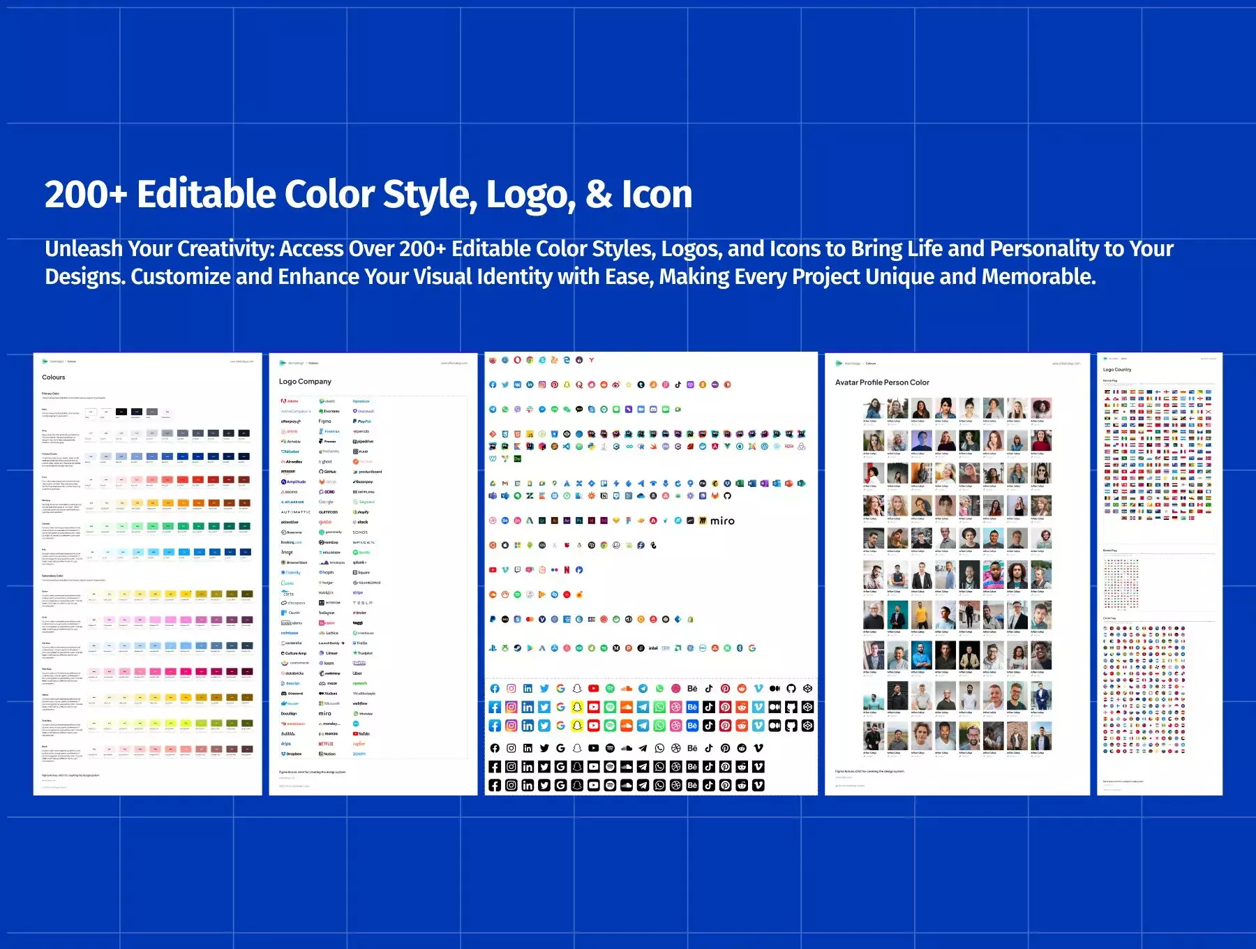
Elevate your designs and create a seamless user experience with Accordions FAQ Design System Kits (featuring Pro Variable Features in Figma). Enhance interactivity, improve content organization, and captivate your users with visually appealing and functional accordions. Get started today and unlock the power of accordions in your designs!
Whether you're a novice designer or an experienced professional, our Accordions FAQ Design System Kits are suitable for all skill levels. Beginners will appreciate the ease of use and the ability to create engaging accordions quickly, while experienced designers can leverage the Pro Variable Features to bring their creative visions to life.
🔥 **This Accordions Design System Kit includes:**
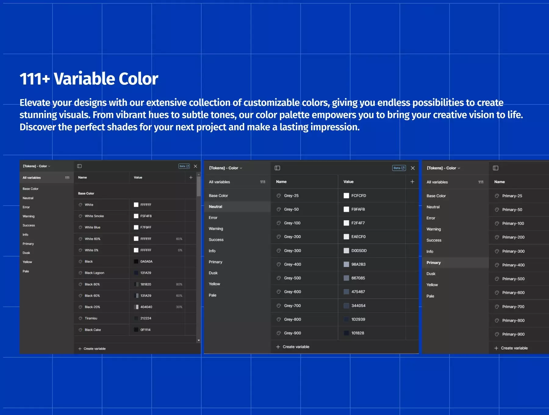
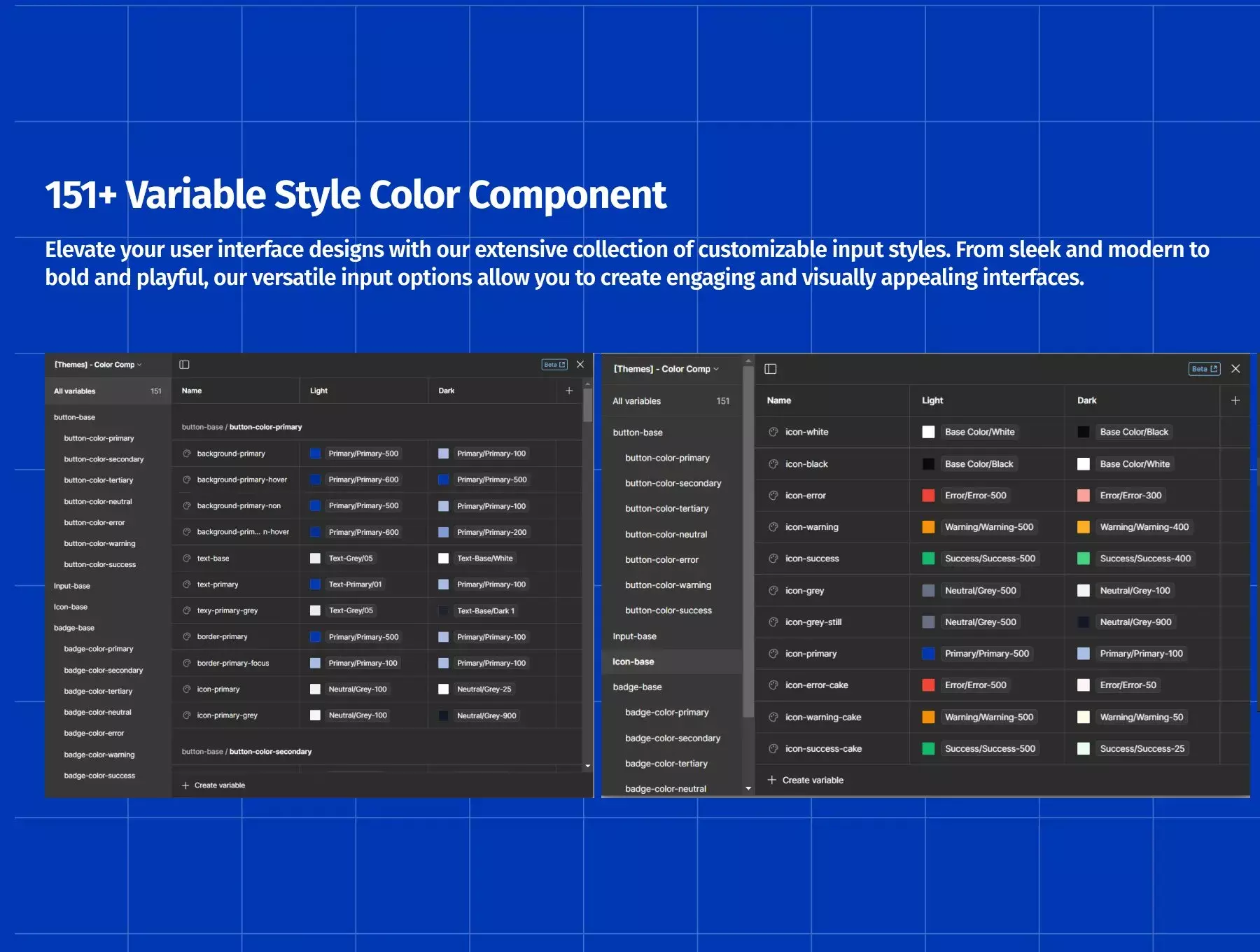
- 111+ Variable Color
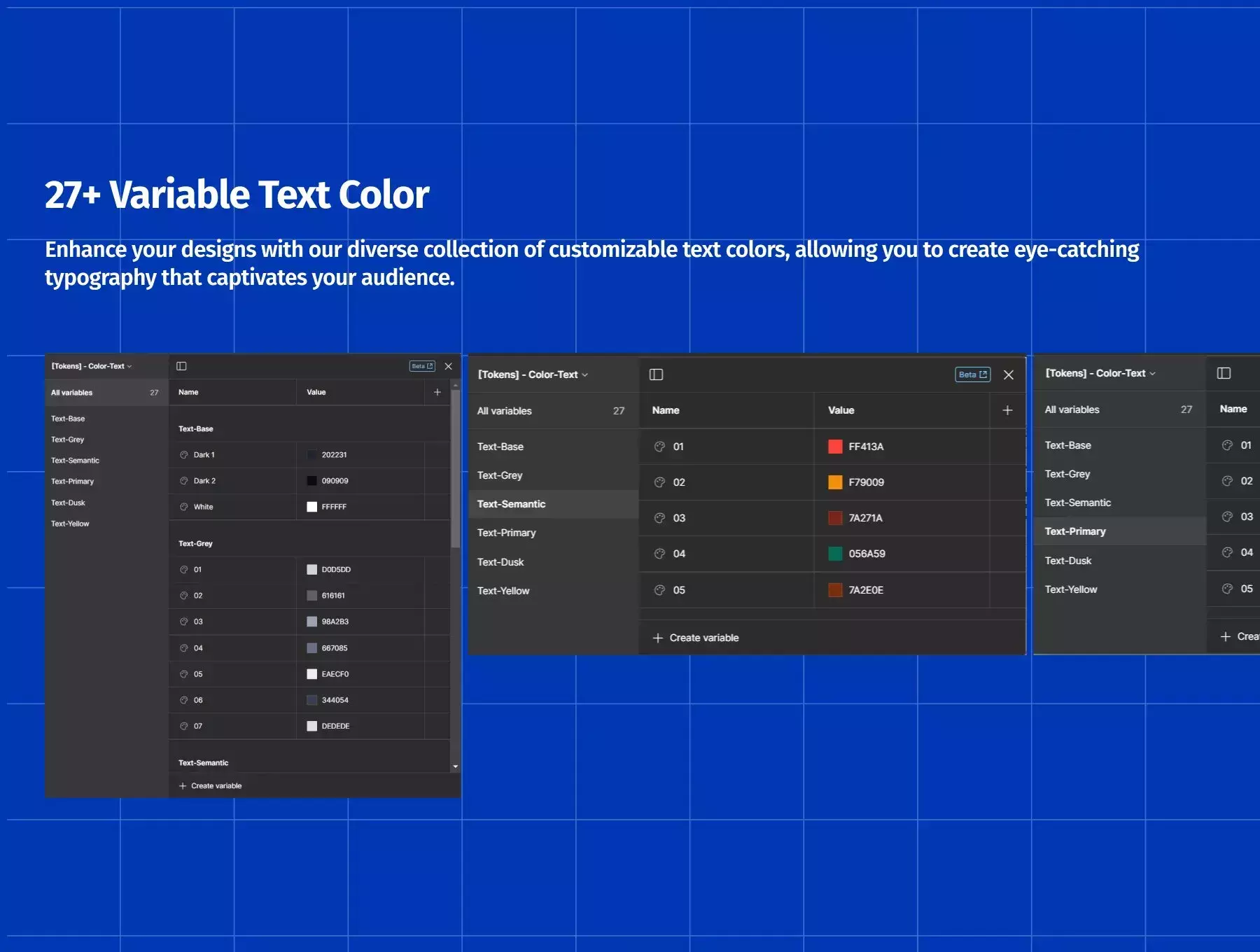
- 25+ Variable Text Color
- 25+ Variable Spacing
- 70+ Variable Style Input
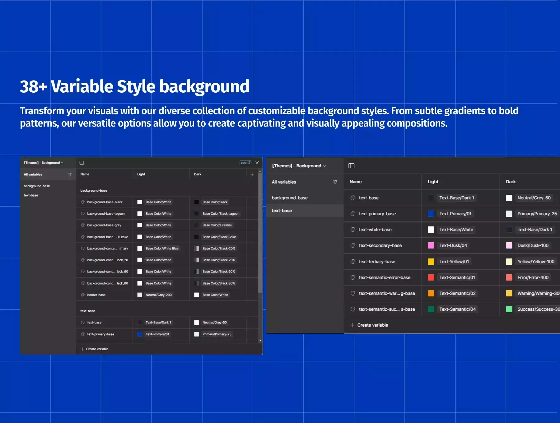
- 15+ Variable Style background
- 2 Mode Variable (Light & Dark)
- 100+ Color Style
- 25+ Text Color Style
- 10+ Image Color Style
- 5+ Logo Color Style
- 50+ Avatar Color Style
- 180+ Typhograpy
- 8+ Drop Shadow
- 8+ Blur
- 100+ Image Logo Company & Bank
- 250+ most used UI icons
- 50+ Loading Items
- Emoji Microsoft
🔥 **This Accordions Design System Kit Style includes:**
- 800+ Style Input
- 20+ Style Text Area
- 600+ Style Form Field
- 20+ Style Form Text Area
- 800+ Style Button Primary
- 600+ Style Button Semantic
- 30+ Sign in Social Media Button
- 250+ Accordions Style
- Variant Size (sm, md, lg)
- Variant Hierarchy (Border & Border Down)
- Variant State (Default, Hover, Focused, Disable)
- Variant Icon (Default, Only, Leading)
- Component Properties Text CTA Input
- Component Properties Layer Icon Input
- Component Properties instance Icon Input
- Variant Size (xm, sm, md, xl, lg, 2lg)
- Variant Hierarchy (Padding & Non Padding)
- Variant State (Default, Hover, Focused, Disable)
- Variant Icon (Default, Only, Leading)
- Variant Border (false, true)
- Component Properties Text CTA Button
- Component Properties Layer Icon Button
- Component Properties instance Icon Button
