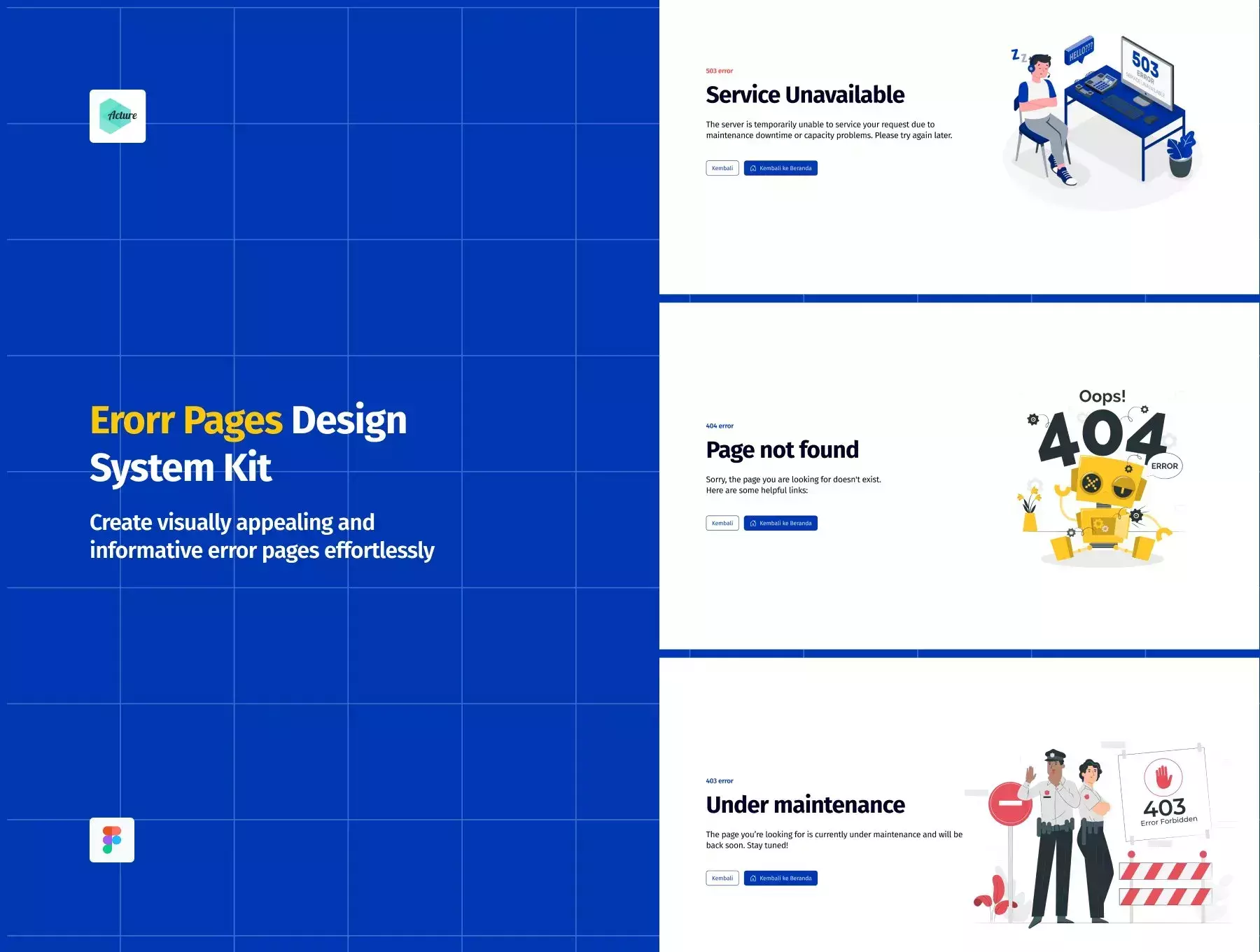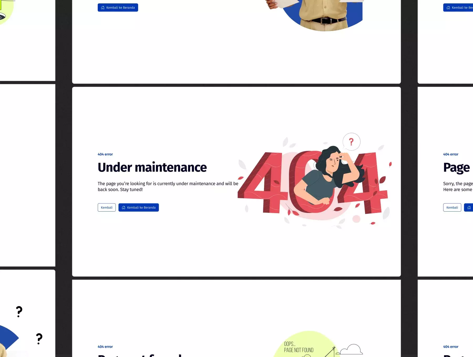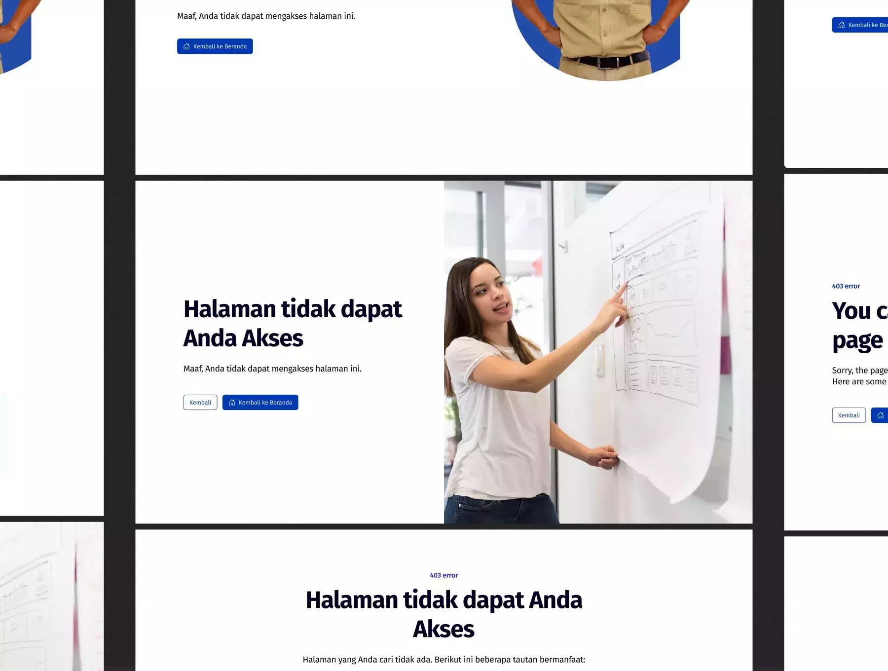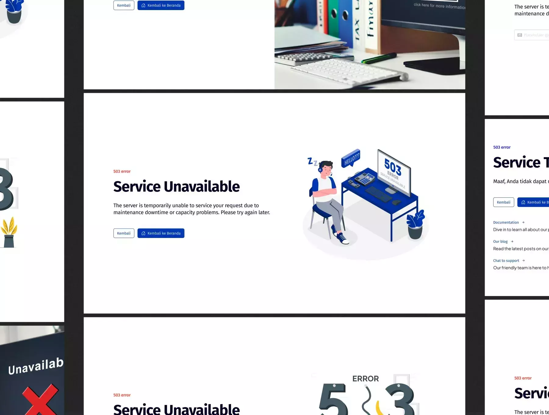
With a wide range of pre-designed components and the flexibility of Pro Variable Features in Figma, you have complete control over customization. Customize the error message, colors, illustrations, and more to align with your brand identity and design preferences.
Make a positive impact on your users even in times of error. Error Pages Design System Kit ensures that your error pages provide meaningful information, guide users back on track, and maintain a consistent user experience.
Empower your designs, impress your users, and create a seamless user experience with Error Pages Design System Kit (with Pro Variable Features in Figma). Get started today and transform your error pages into a valuable opportunity to engage and retain users. #ErrorPages #DesignSystemKit #FigmaDesign #VariableFeatures #UserExperience
🔥 **This Error Pages Design System Kit includes:**
- 111+ Variable Color
- 25+ Variable Text Color
- 25+ Variable Spacing
- 70+ Variable Style Input
- 15+ Variable Style background
- 45+ Variable Color Keyboard
- 99+ Variable Key Keyboard (For Prototyping)
- 2 Mode Variable (Light & Dark)
- 100+ Color Style
- 25+ Text Color Style
- 10+ Image Color Style
- 5+ Logo Color Style
- 50+ Avatar Color Style
- 180+ Typography
- Apple Font For Windows
- 8+ Drop Shadow
- 8+ Blur
- 100+ Image Logo Company & Bank
- 250+ most used UI icons
- 50+ Loading Items
- Emoji Microsoft
- 13+ Web 404 Error Pages
- 13+ Web 403 Error Pages
- 12+ Web 503 Error Pages
- 13+ Mobile 404 Error Pages
- 13+ Mobile 403 Error Pages
- 12+ Mobile 503 Error Pages
